RESET - Redesigning Equality and Scientific Excellence Together
RESET is a Coordination and support action funded by the European Union under the Horizon2020 programme, and the call “H2020-SwafS-2020-1”. RESET involves seven large multidisciplinary universities from all over Europe (University of Bordeaux, Aristotle University of Thessaloniki, University of Łódź, University of Porto, Ruhr-University Bochum, University of Oulu, Sciences Po Paris) and aims to address the challenge of Gender Equality in Research Institutions in a diversity perspective, with the objective to design and implement a user-centered, impact-driven and inclusive vision of scientific excellence.
Date
2021
Domain
2021
Domain
Branding
Client
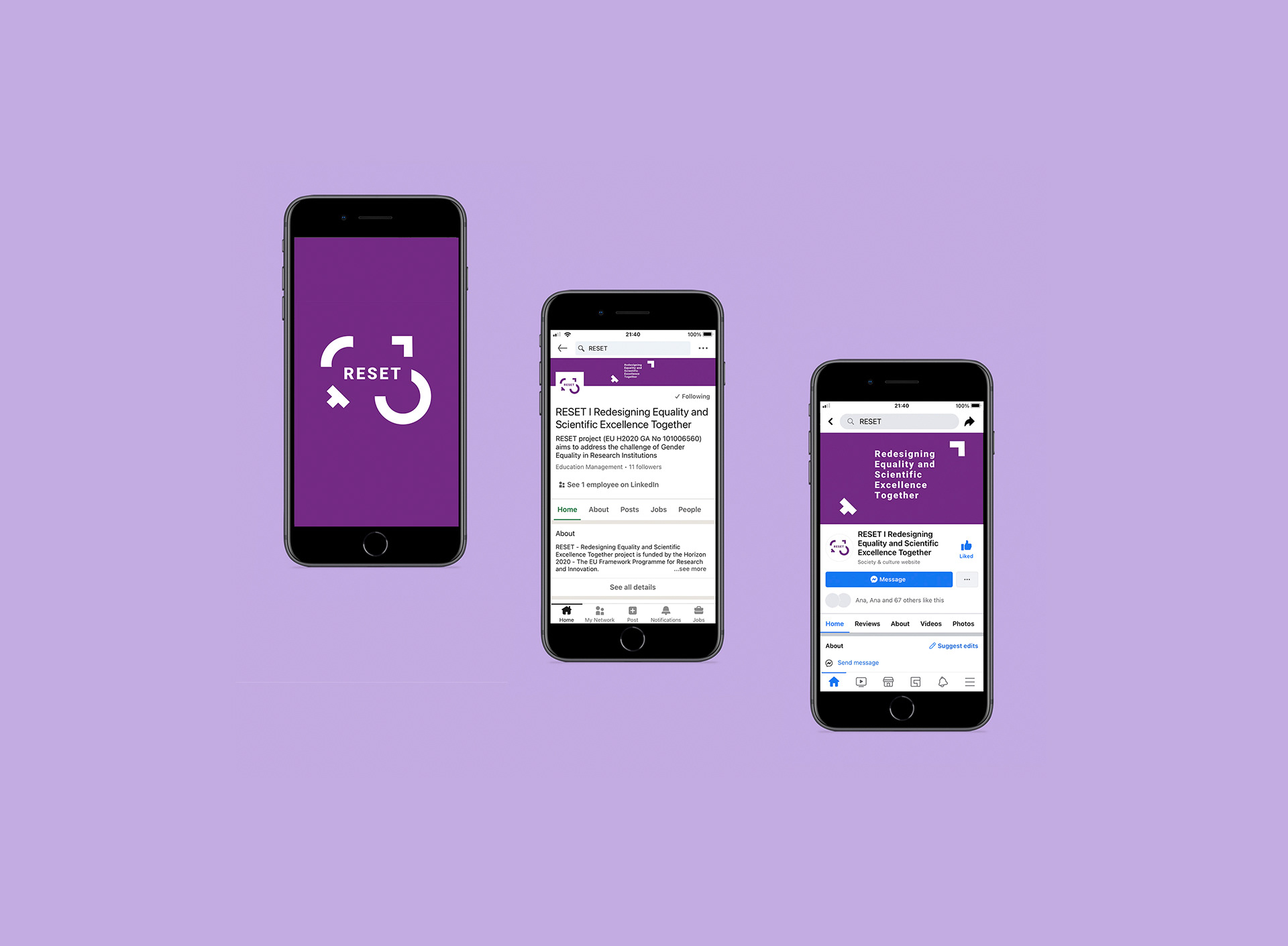
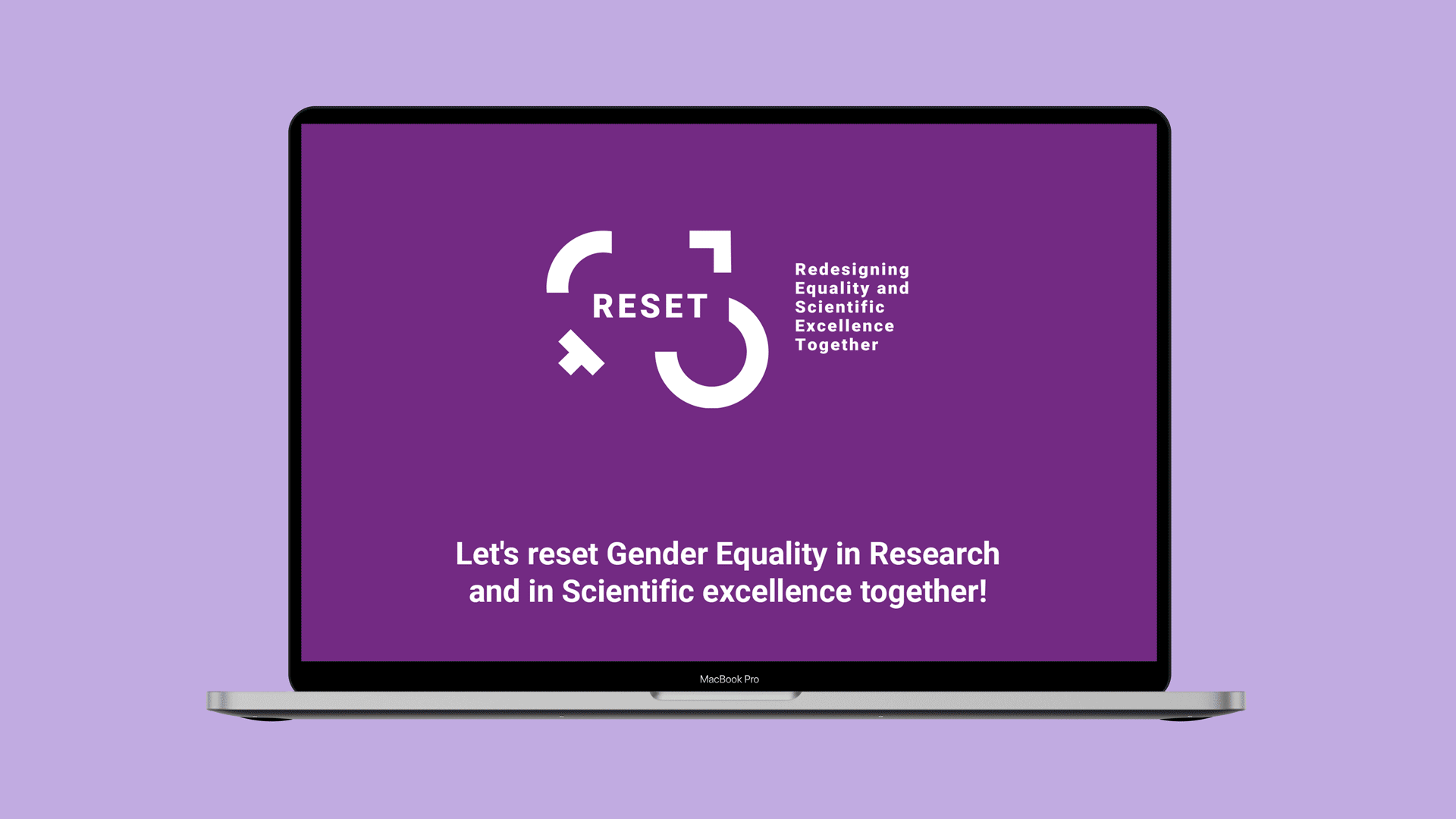
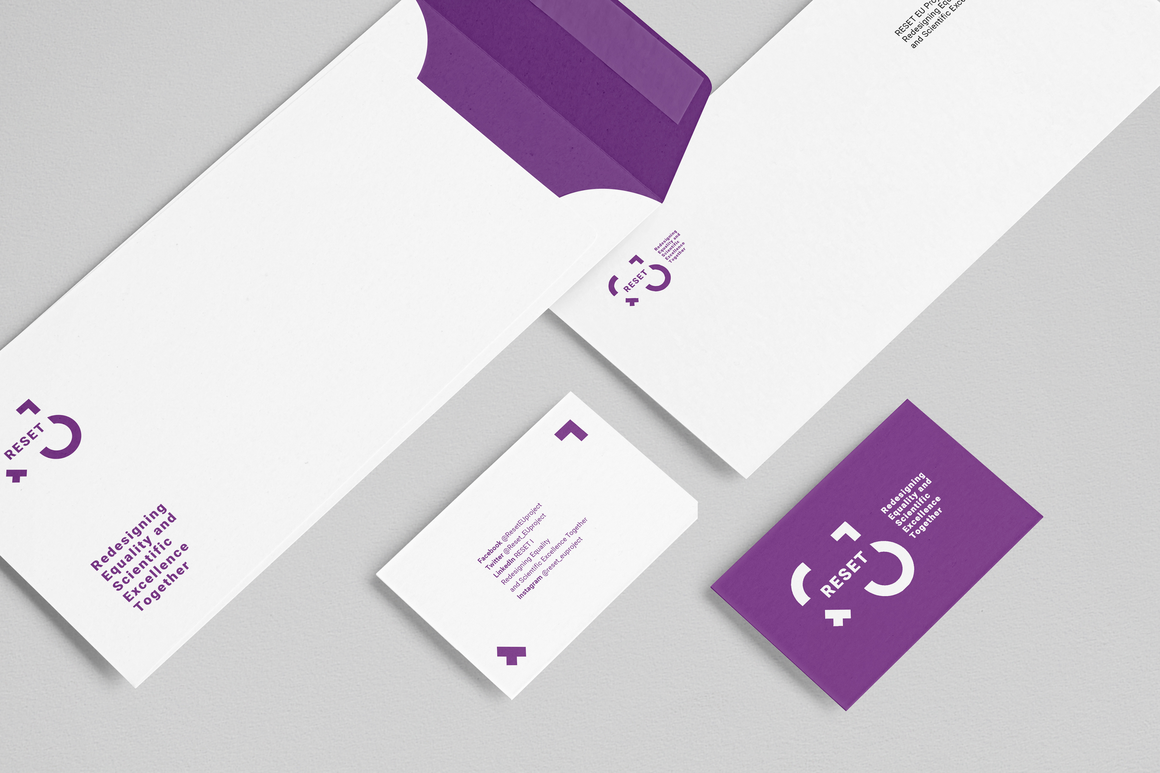
RESET
Team
Sofia Correia / Ana Leite
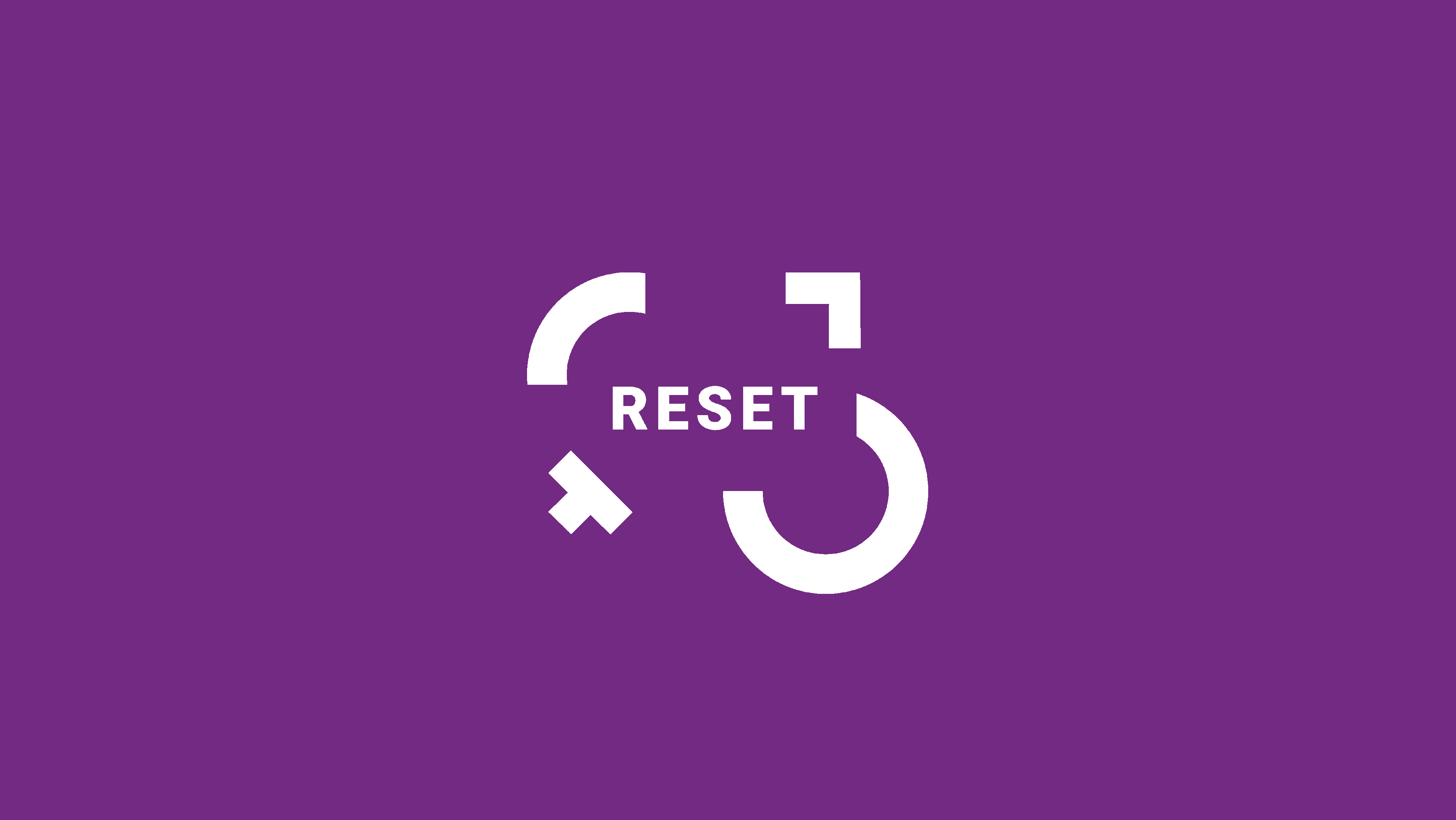
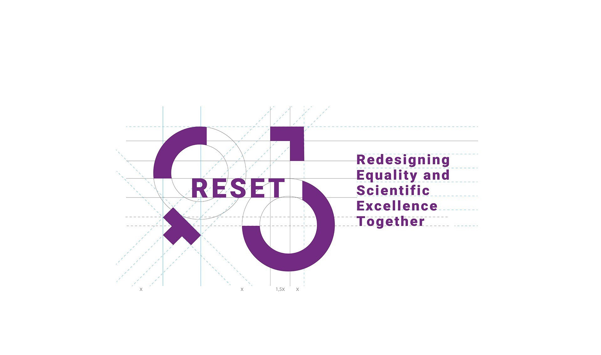

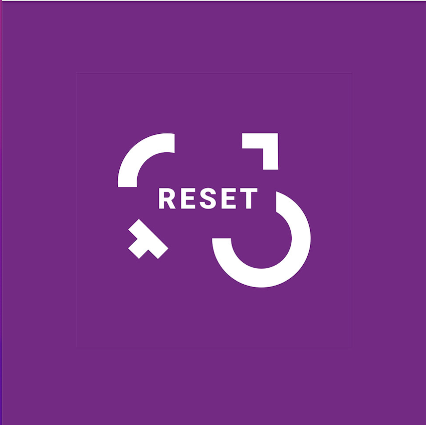
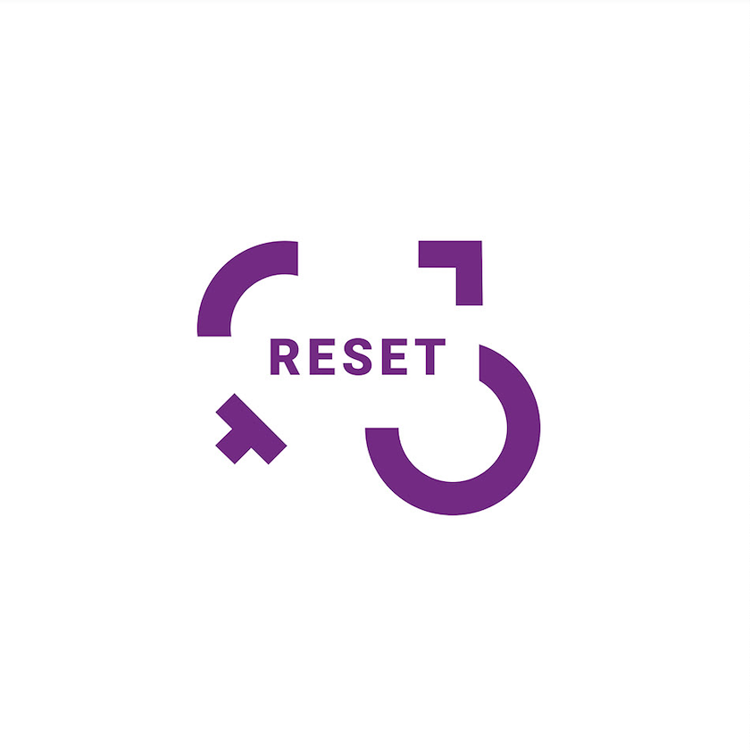
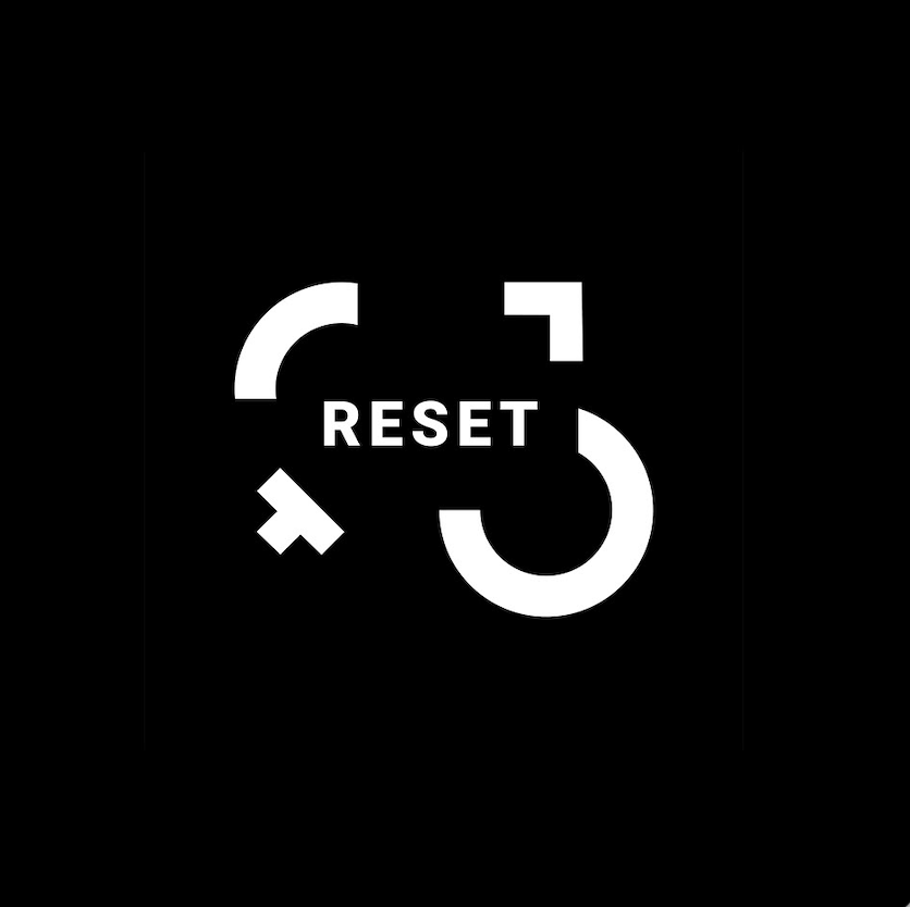
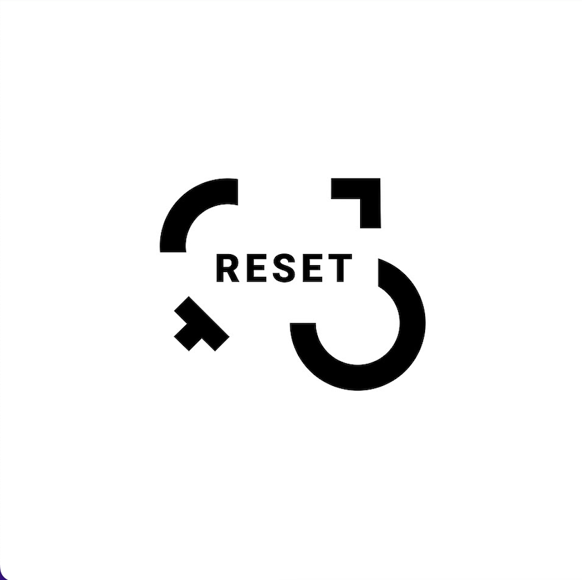
Logotype
The use of distinct forms arises in appeal of the union of difference and diversity. The fragments
of the circle, besides completing
the form of the gender symbols, represent the construction and the redesign of the representativeness of gender and status. The idea of construction also emphasizes the process of the scientific research and the crossing of data. The disposition of forms reinforces the idea of dynamism and restructuring.
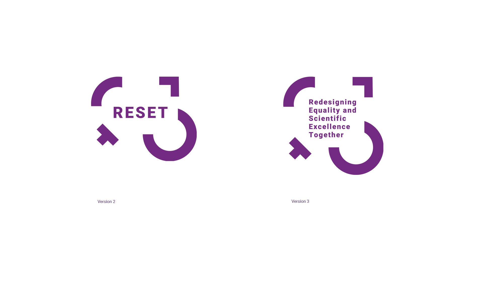
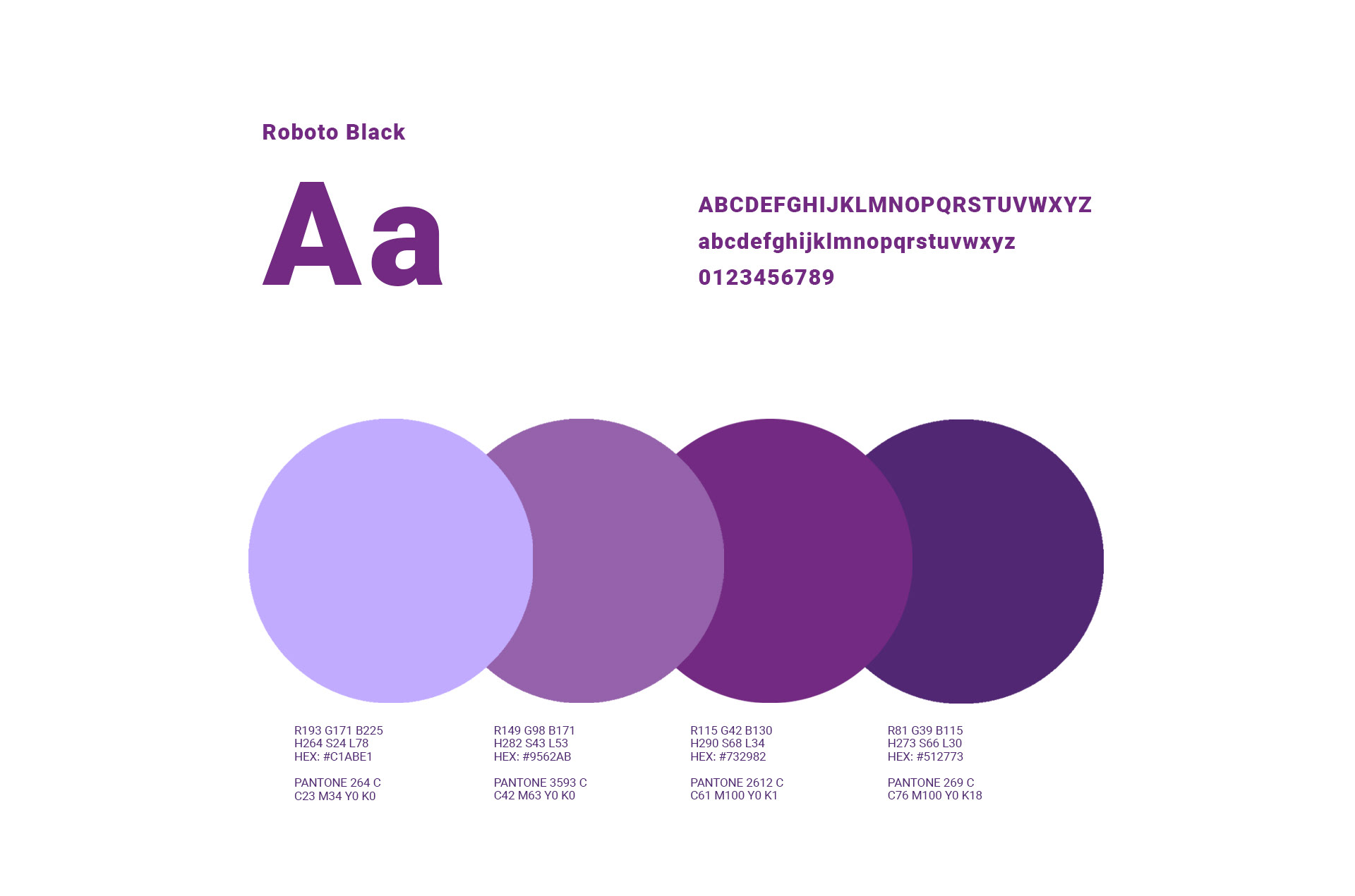
Color Scheme
Purple is the color commonly associated with gender equality. The chosen purple is a strong
color that enhances the project and highlights its interventional character. The entire logo is represented with only one color enhancing, therefore, the concepts of equality and unity.